Year
2025
Client
Personal Project
Category
Case Study
Product Duration
3 - 4 Weeks
The Indian Railway Catering and Tourism Corporation (IRCTC) app is a crucial platform used by millions to book train tickets. However, the current experience often feels outdated and clunky.
This redesign focuses specifically on improving the Train Booking flow, making it more intuitive, mobile-friendly, and visually refreshing — without compromising on functionality.
Simplify the train booking process
Eliminate external browser redirects
Improve overall usability for mobile users
Enable real-time updates and easy booking management
Simplified & Intuitive Navigation
Streamlined bottom navigation bar with key sections: Home, Bookings, Account, Settings.
Prioritized user actions (modify, cancel, track) with quick-access buttons.
Modern, Consistent UI Design
Fresh visual language using clean typography, proper spacing, and modern icons.
Improved visual hierarchy to guide user focus and improve scanability.
Ad-Free or Non-Intrusive Experience
Significantly reduce or reposition ads to avoid disrupting core actions.
Offer a cleaner, more focused user journey.
Instant View of Ticket Availability & Prices
Show availability and fare summary directly on the train search results screen.
Allow easy comparison across trains without extra taps.
Integrated Real-Time Train Tracking
Built-in live status tracker for booked trains.
Includes location updates, estimated arrival times, and delay indicators.
Old vs. New: A UI Makeover
To showcase the impact of the redesign, here’s a side-by-side comparison of key screens. The "before" images reflect the cluttered, outdated interface with scattered information and poor usability. The "after" designs highlight a cleaner, more intuitive layout focused on user needs, real-time updates, and a seamless booking experience.
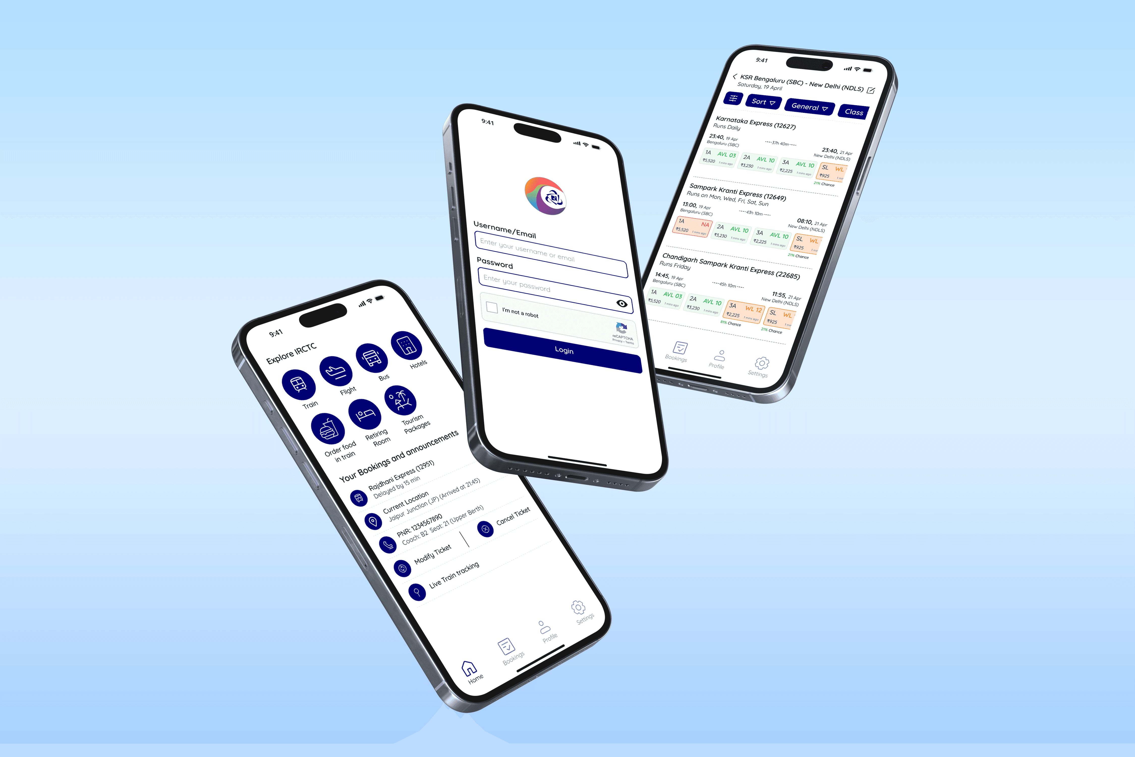
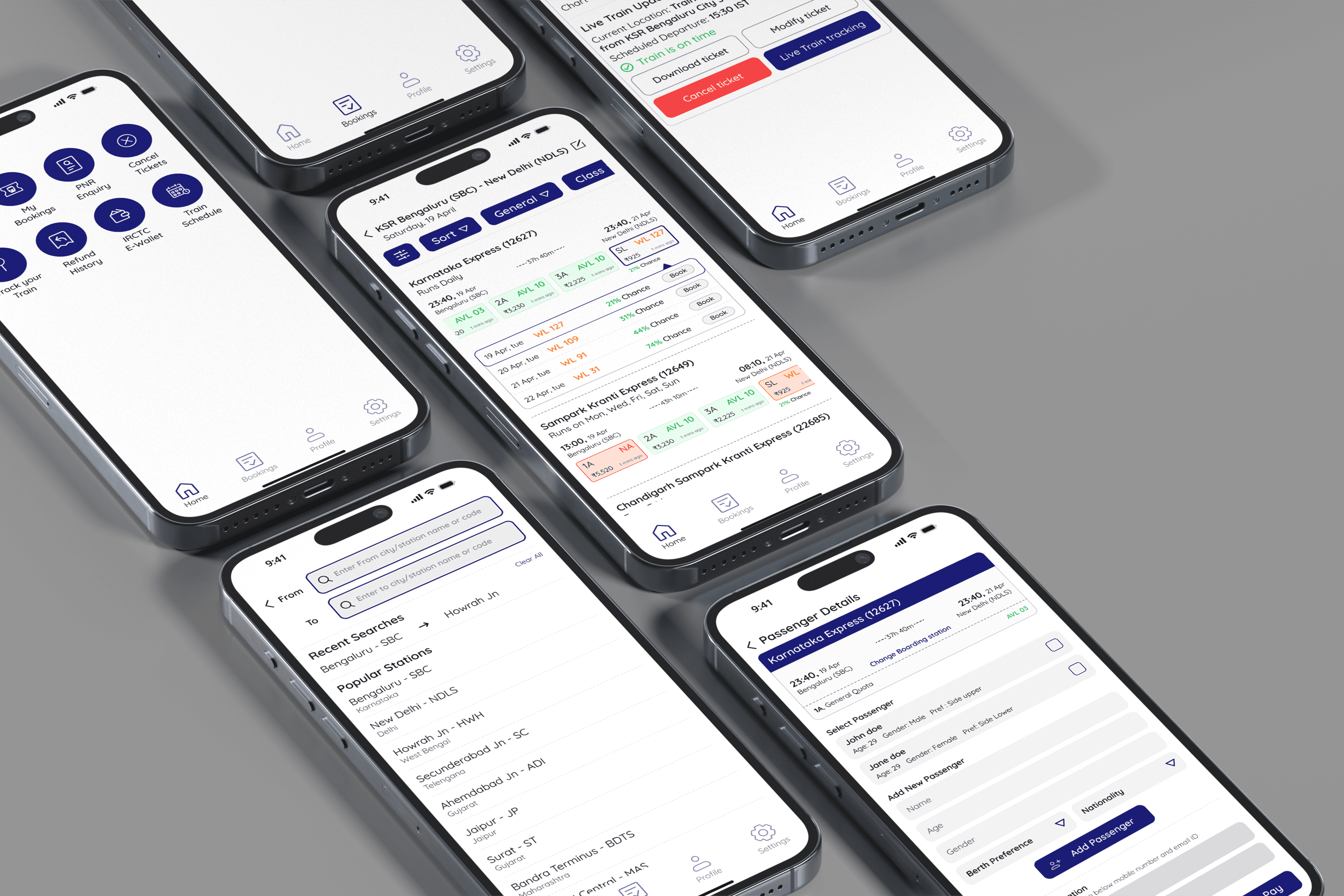
UI Design
Once the usability issues were resolved, I moved on to design the final screens in Figma. A clean, mobile-first redesign of IRCTC’s train booking experience — from simplifying the login and home screens to surfacing real-time train info and seat availability upfront. Focused on clarity, usability, and reducing friction at every step.
Key Takeaways
Government interfaces benefit from simplicity and clarity more than flashy visuals
Redesigning IRCTC required deep thinking about real user needs, especially under poor network or stressful travel conditions
Visual warmth through typography and color creates a more trustworthy experience